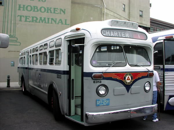
Been thinking about a paint scheme for The Ghost
Was linked to a few pictures of the coach as factory delivered. Stock:
Here’s a photo of one shortly after delivery (color change for following years):
I’m personally leaning more towards the first photo as I like the grey/white/navy-blue almost black color stripe. Simple, clean, easy to hide imperfections. Will have to fix the head-sign back so I can put cool messages up there. Also like to produce a nice emblem for the middle section instead of “Public Service”
Hum. Thoughts?


![PSCT_J307_Hoboken_6-24-72JT[1] Color Change Later On](https://theghostbus.org/wp-content/uploads/2012/01/PSCT_J307_Hoboken_6-24-72JT1.jpg)
I was excited to see the 1970’s era “Jungle Habitat” signage on the front of the green version of your two pictures. I went there as a little kid as I vaguely recall, although “Great Adventure Six Flags” also a jungle animal park back in the day. I’ll ask my dad to look at the two pictures, but the one you like in Hoboken is probably painted different then the way it was painted if it was a City of Newark New Jersey bus. I’m partial a Newark specific paint job!
Whose bus is the refurbished one in the picture shown in Hoboken? Looks like a private owner for at least 10 years based on the blue NJ plates. And by the way: GO New Jersey Giants!!!!!
I vote for dazzle:
http://en.wikipedia.org/wiki/Dazzle_camouflage
I vote to protect the current look and finish with an autoboday clear coat from a can. Anything else would not be the Ghost.